

I need some opinions on two things. First the blog. I think I've finally finished tweaking the design, so let me know what you think, how it all works, and what (if anything) you think needs to be fixed or added.
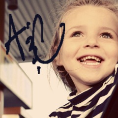
Also, I made a logo for Blessed Road Photography, and would love your input! What do *you* think?
![]()


4 Responses to “Opinions, please!”
I love the font you chose for your Photography logo. It looks very classy and sophisticated. I am not sure about the swirls behind it. I like them but it seems like they are too heavy. I love the suttleness of your blog background. Nice on the eyes. :)
Hey Jo! Dad and I both like the logo! The background almost looks like a nest.
If the background swirls are a little dark, could you lighten them a bit? Dad thought the darkness made the words "pop," but you could try making the swirls a very dark charcoal gray and see how that works.
Mom :-)
Looks really great. I like how chaotic and organized it looks at the same time.
Hi! I just stumbled on your blog a few weeks ago, and I love it. I think your pictures are great, I love the vintage-y look you have to many of them.
Sara
Post a Comment